Intro
The construction of the brand was based on the need for engaged women to have someone they trust in public management, someone who brings up latent discussions in society, involving women’s empowerment, entrepreneurship and women’s rights.
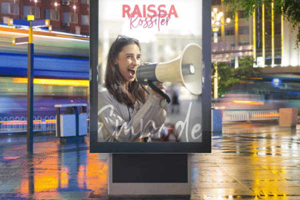
The solution is an open, inviting, vibrant and strong brand. An identity that is synonymous with social engagement, fighting for equality, accessible, feminine, dynamic and innovative politics.
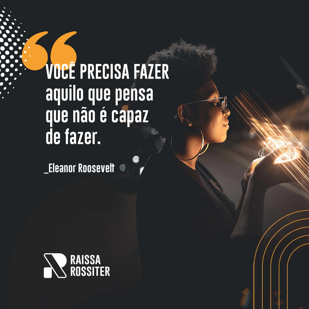
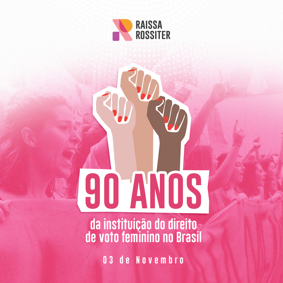
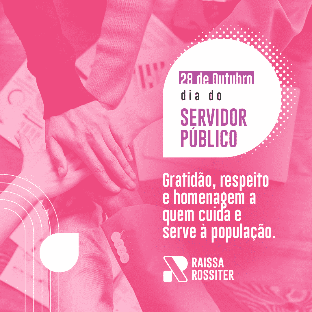
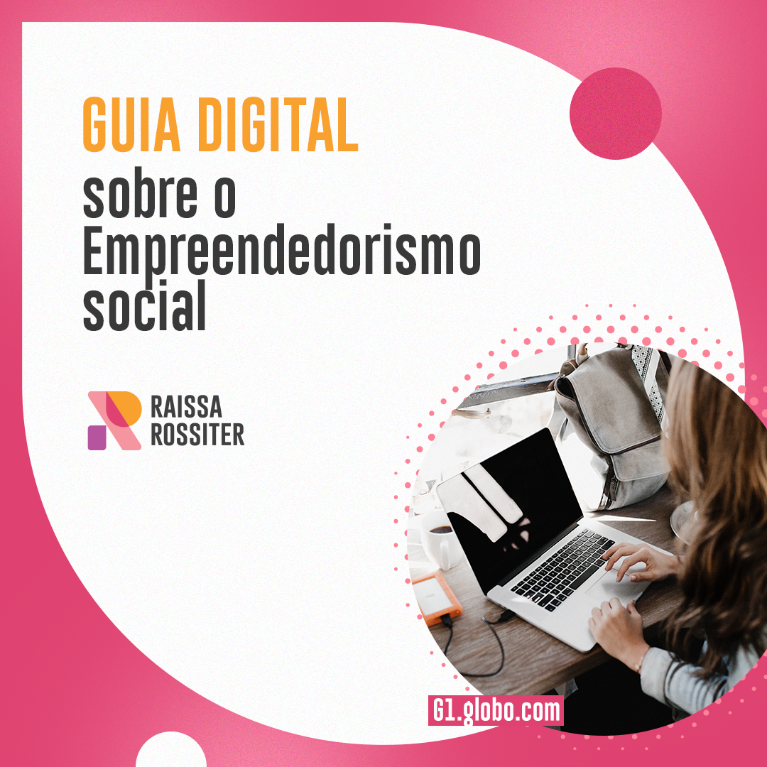
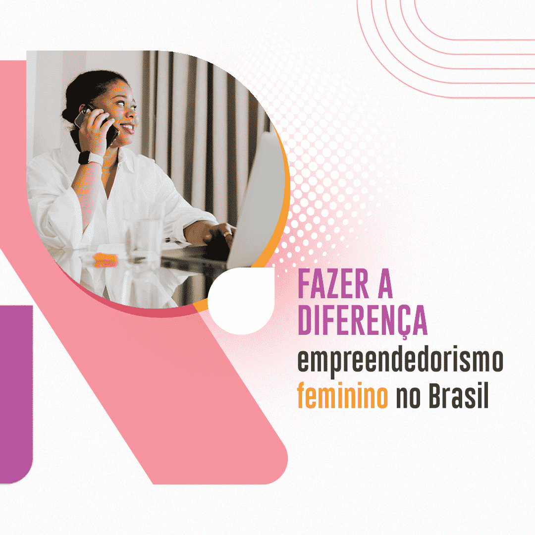
A graphic system that helps pave the way for the brand in communication, so that the client can position herself as an authority in public life, in order to support her future applications.
Our solutions
We structure the solutions into three main deliverables: Brand Structuring, Visual Identity and Website Building.
Client
Raissa is an amazing woman with a history in politics and activism who deserves to take on the world.
The client’s perspective
on the project
Our result is reflected in the customer’s perception. Raissa left a quick message about the project, about our partnership that overcame the briefing, and provided us with a lot of learning. Thank you Raissa!
Visual References
References were collected based on the brand’s area of operation – people and companies that aim to engage society to reduce differences between classes, races and gender.
Brands are mostly logos, meaning completely typography-based.
There are few references that are concerned with structuring a brand identity system.
In our experience, most people neglect this very essential step, putting us a few steps ahead in terms of communication strategy.



Moodboard
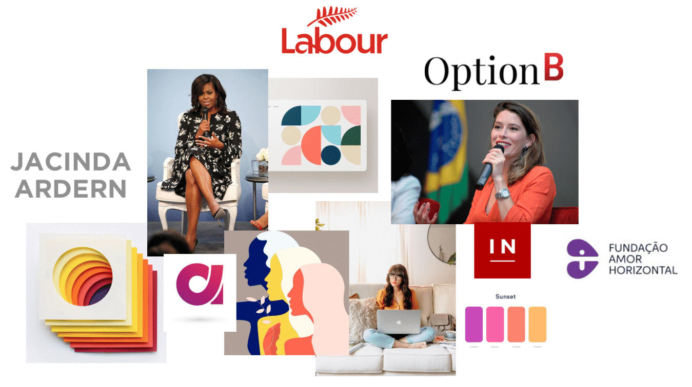
The moodboard is a kind of mural where we will display visual elements that convey the feelings we want for the brand. They are inspirations of shapes, colors, motifs and visual elements.
Nothing on the moodboard is put there to necessarily enter the final mark. The moodboard analysis should be from a more abstract, subjective perspective, trying to see if what is presented there represents what you want as a brand.
We want to bring the essence of the brand, expressed in visual elements.
The concept
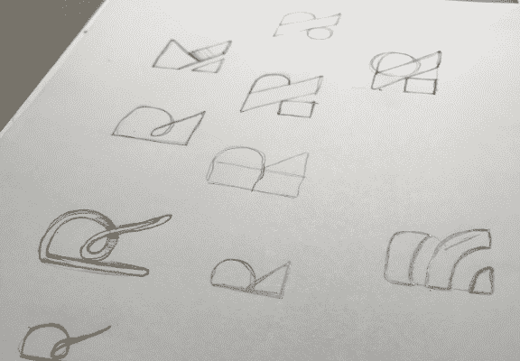
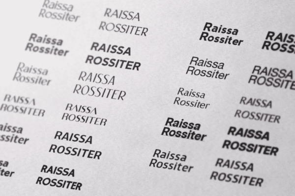
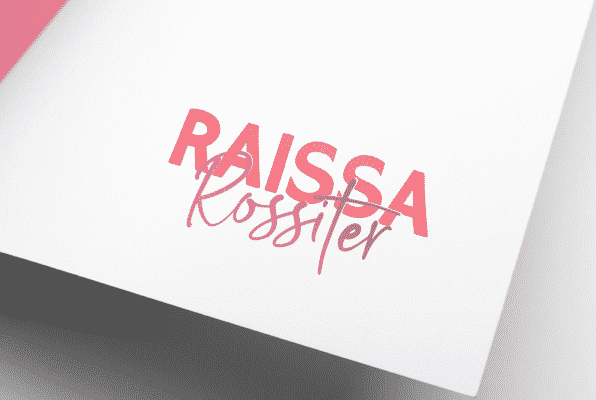
Taking the previous steps as the foundation of the design process, we approached several possibilities, made dozens of designs, tested several typographies and, finally, we selected two different approaches to select, among them, the logo that will be the center of the brand’s visual identity .
Logo ideas
Building Blocks
We call this version Building Blocks because the brand's icon, the initial R, is composed of blocks, separate parts that, together, build something bigger.
Inspired by the Bauhaus aesthetic, a renowned German art school from the beginning of the century. XX, this version has the potential to use the brand icon alone, facilitating use in small spaces.
Line of action
After the presentation of the concepts, Raissa was very interested in both possibilities.
After deliberating with his family and friends, the identity chosen to proceed with development was “Building Blocks”.
We had concerns about the readability of the word “Rossiter” in the first option. The second is an approach closer to most people, more relatable, easy to read, solid and coherent concepts, in addition to presenting an icon that we’ll work with in the developments.
Suggested changes
Once the course of action was defined, we carefully collected Raissa’s feedback: what she liked, what could be improved.
The first request was about the source of the written name. It was too simple, without personality, too common.
The second request was about colors: we need brighter, more radiant colors, perhaps with a gradient.
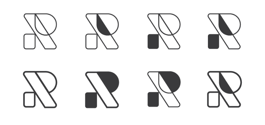
Study of the possibilities of the negative version of the brand icon.
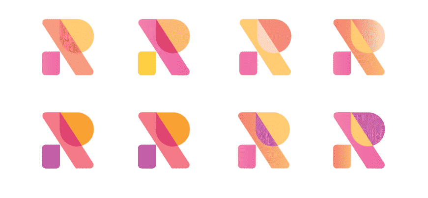
Study of colors and shapes of the brand icon.


Brand Book
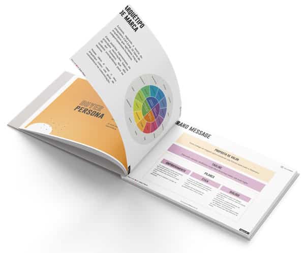
Finally, we have structured all the information about the Raissa Rossiter Brand into a manual – a PDF of about 30 pages containing all the guidelines for using the brand. This allows the client to be autonomous from then on to manage Branding and brand communication.
